

Aeroflot Russian Airlines
Rebrand for Aeroflot
Brand Strategy
Brand Identity System
Instructor
Gerardo Herrera
Aeroflot Russian Airlines is Russia's largest national airline and has been in this industry for 98 years; it is now among the richest in tradition and the most experienced airlines worldwide. Aeroflot is a market leader in Russia and ranks high among global airlines.By redesigning the visual system, we hope to find the general visual rules that the industry is taking to make our strategies work for Aeroflot and update the identity system, elevate it.
︎︎︎New Logo
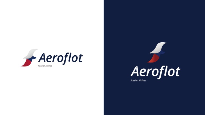
The new Aeroflot logo is inspired by its highly-standardized services and the customer-centered spirit of the company. It stands for the Aeroflot “A,” representing the determined and dynamic gesture of the plane taking off, traveling through the clouds to the passengers’ destination with the experienced and reliable crew. It is highly flexible and easily applicable.
The word mark combines the shape of the new logo with a hint of directional details, representing the innovative and efficient Aeroflot group as they are marching to the future.
︎︎︎ Check out the process here
The word mark combines the shape of the new logo with a hint of directional details, representing the innovative and efficient Aeroflot group as they are marching to the future.
︎︎︎ Check out the process here
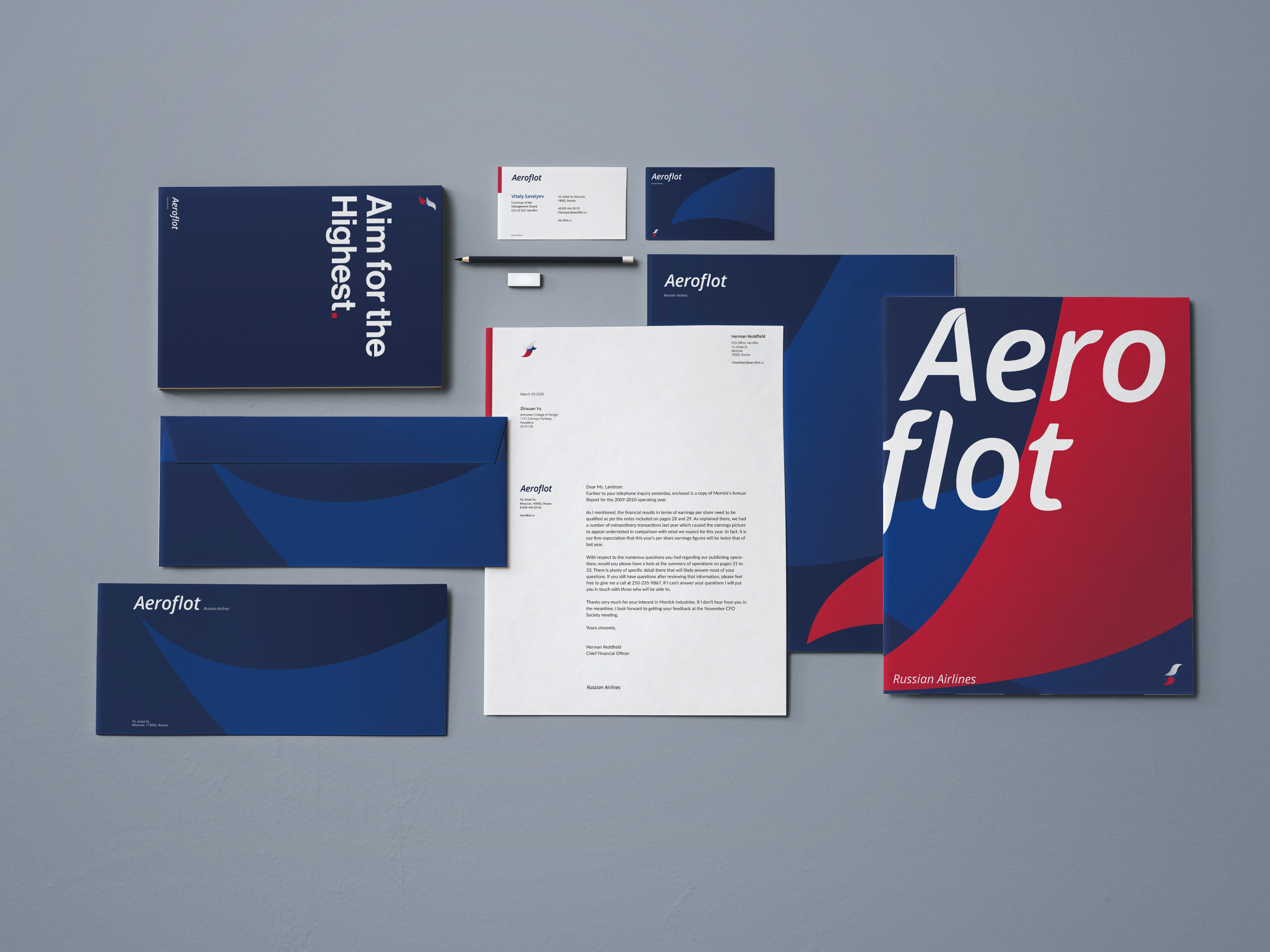
︎︎︎Stationery System

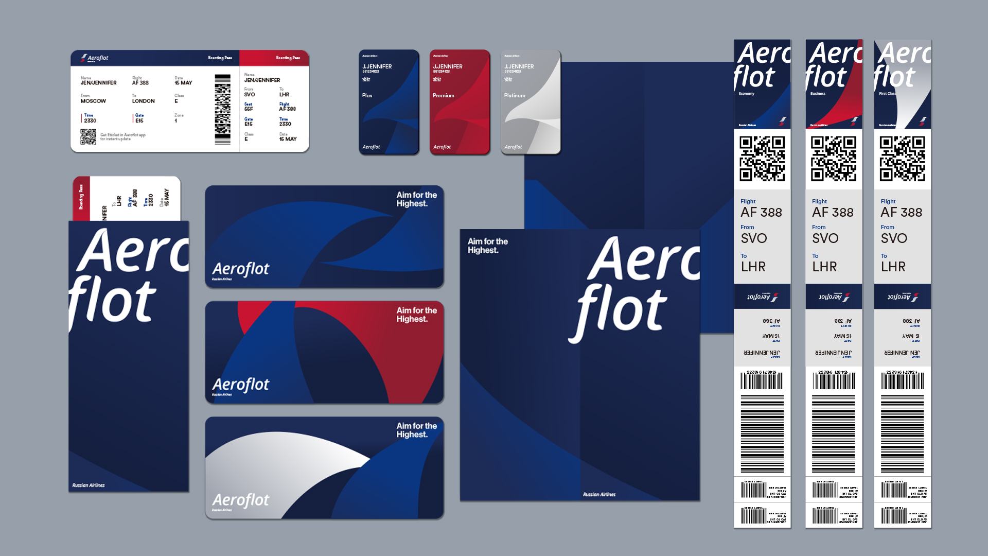
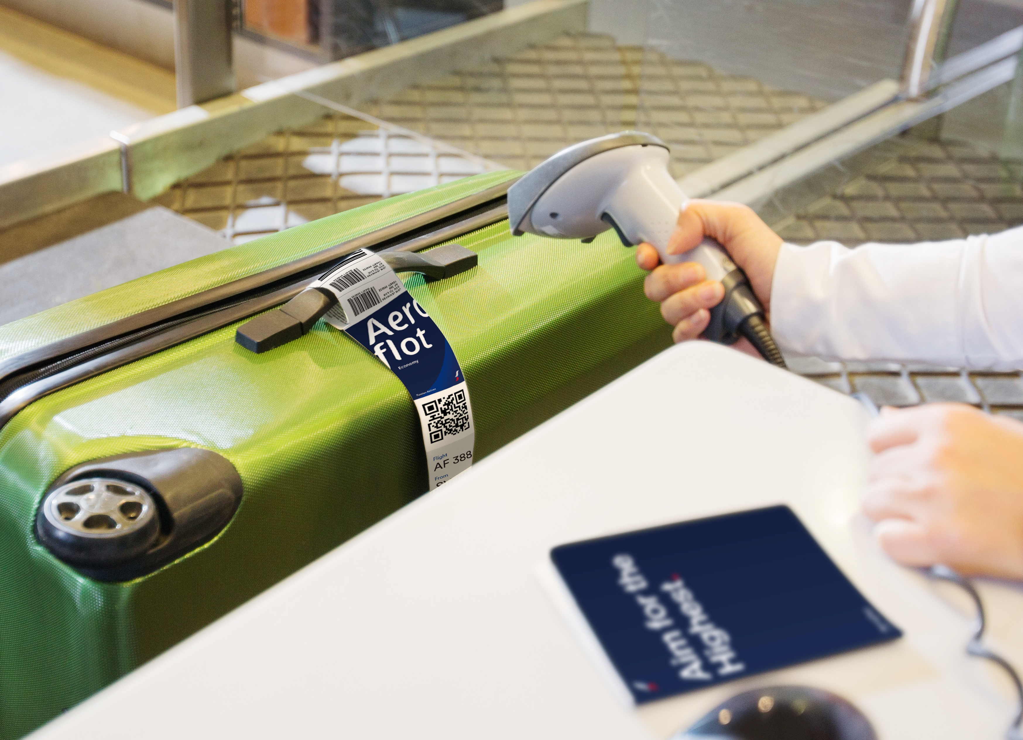
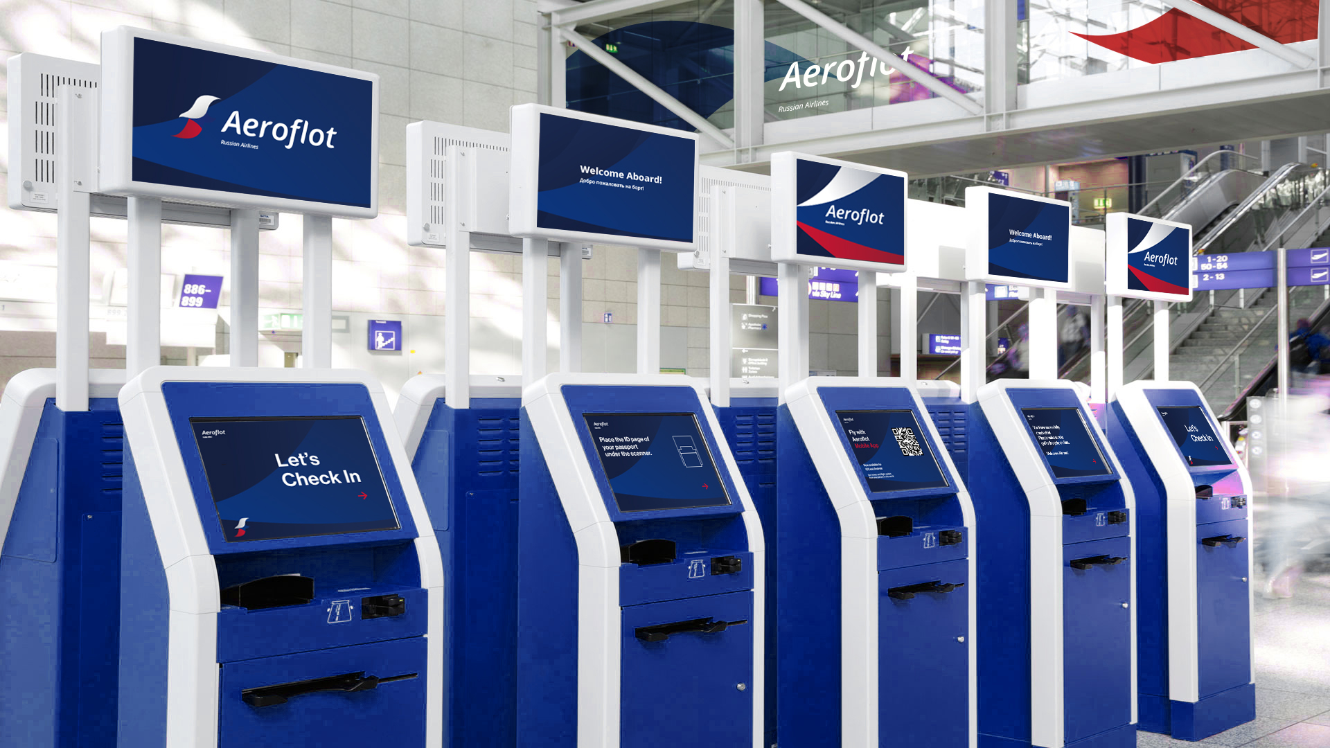
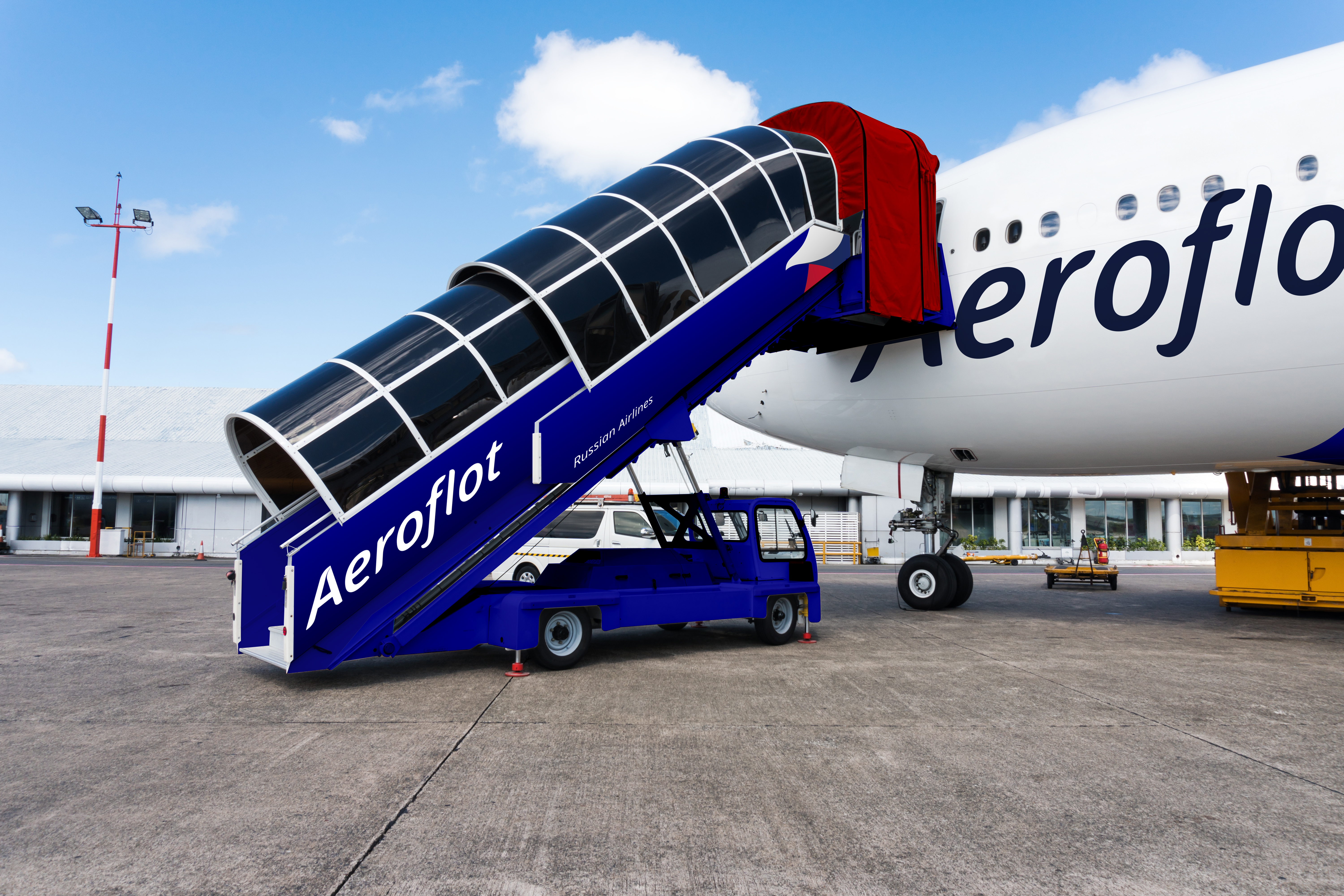
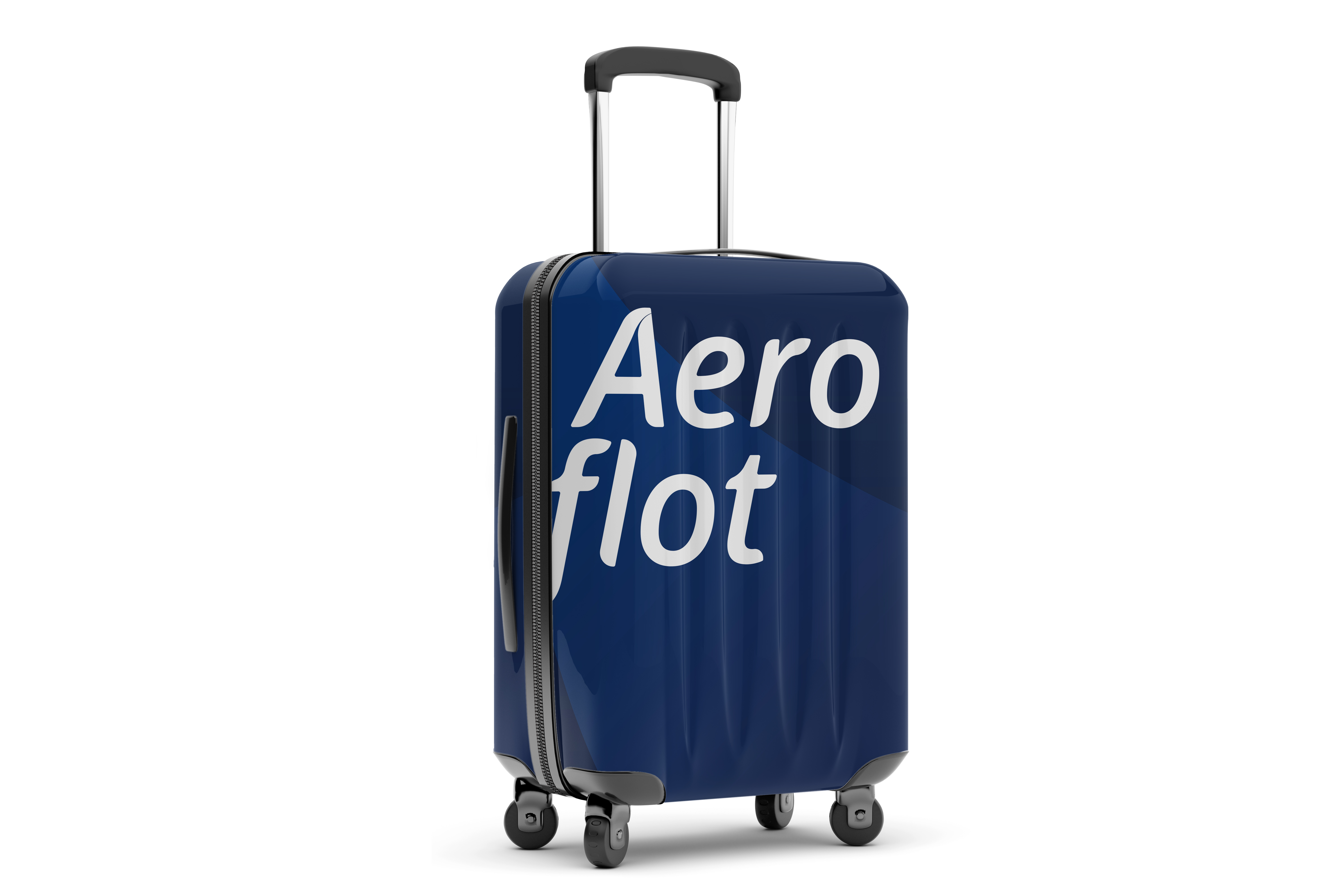
︎︎︎Airport Appliances
The appliances are updated with the cohesive new look.

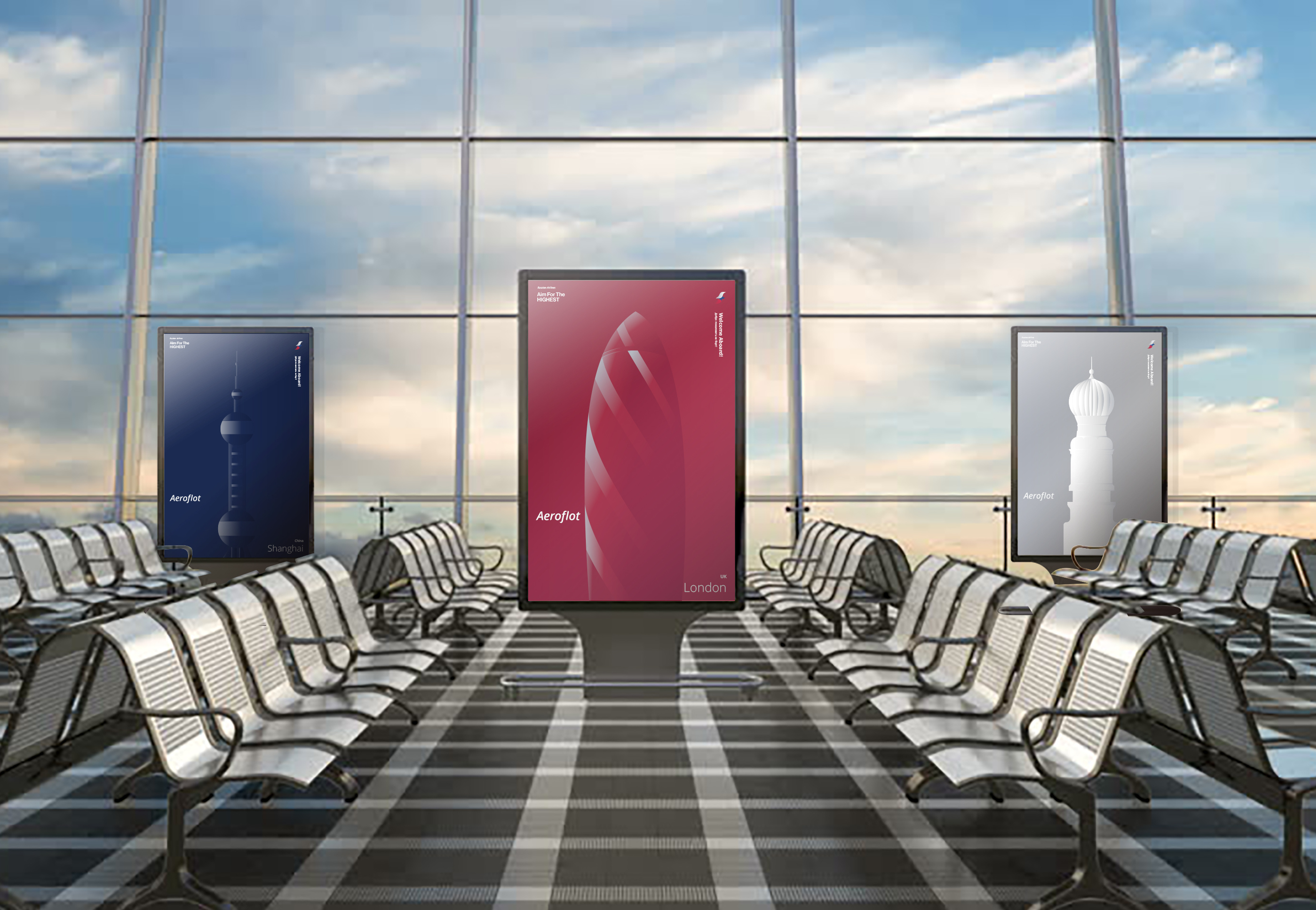
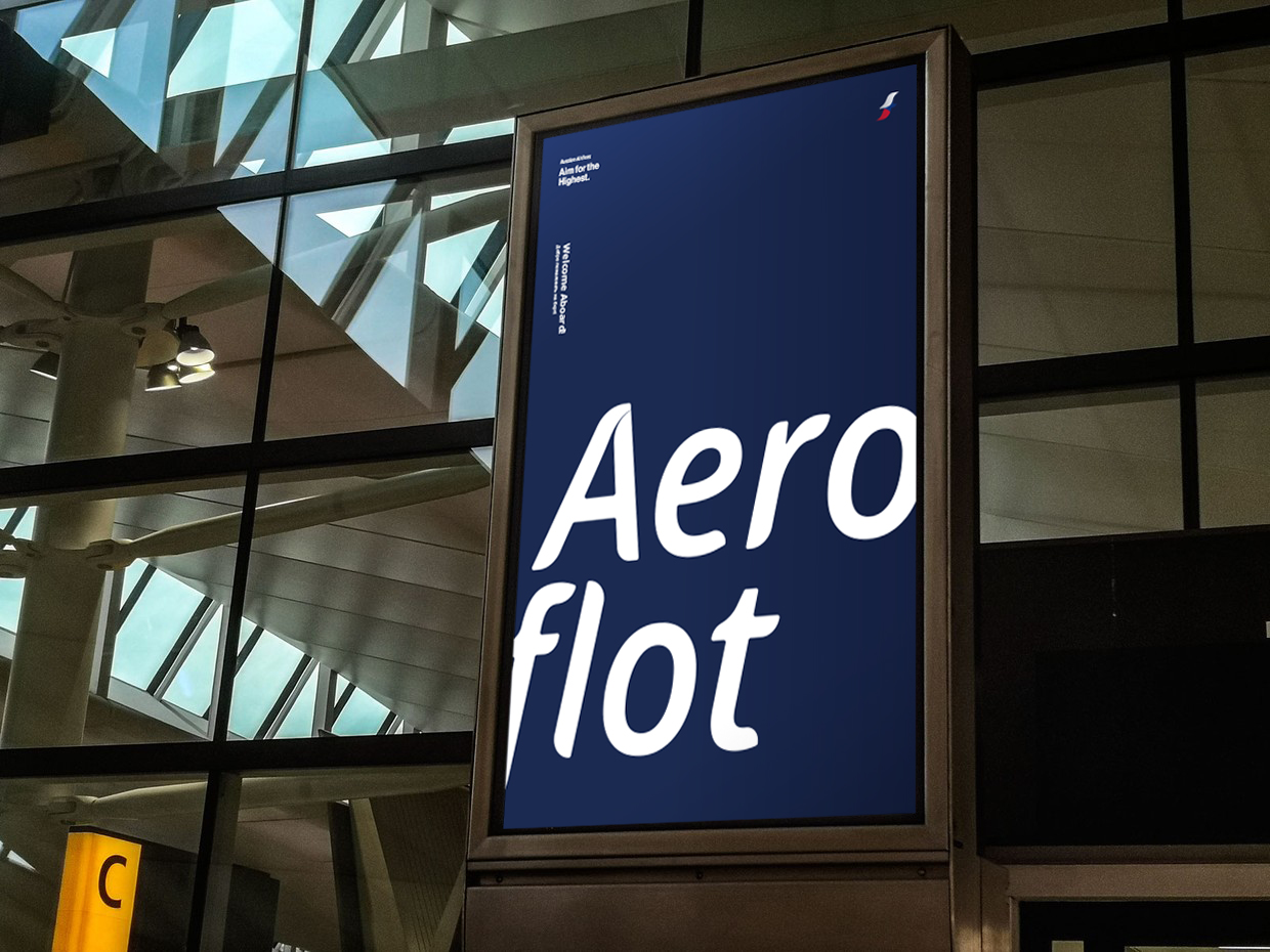
︎︎︎Promotion Posters
‘

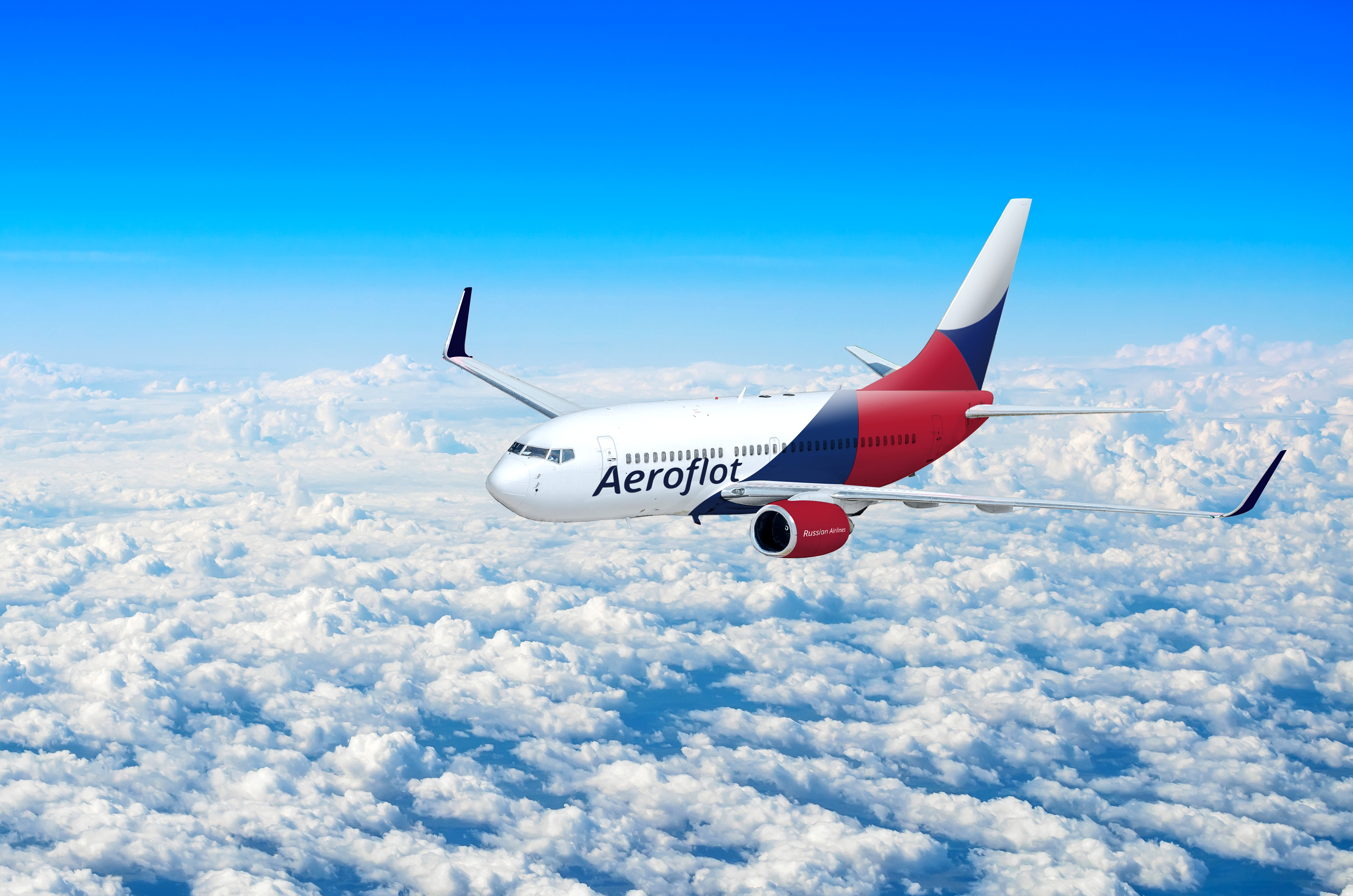
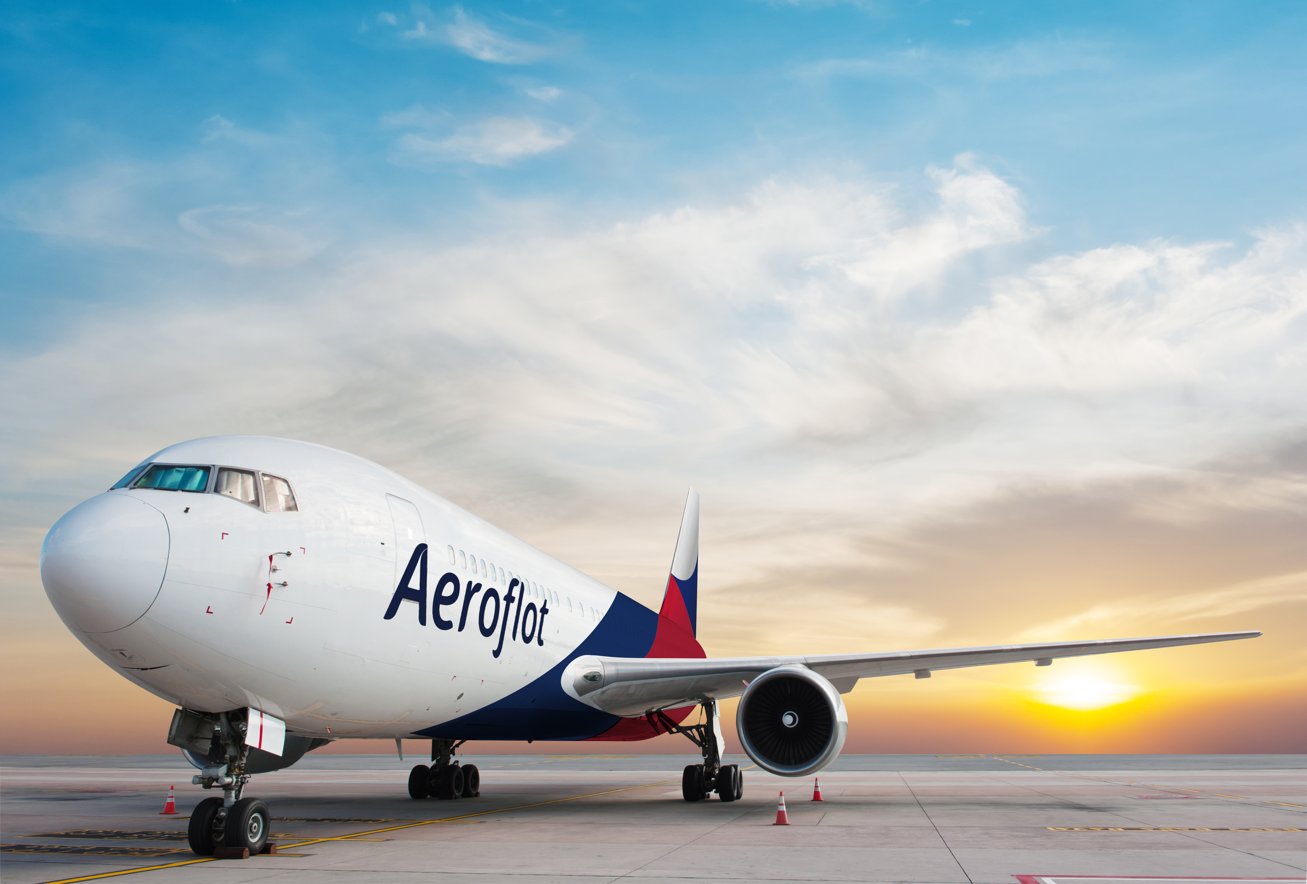
︎︎︎Livery
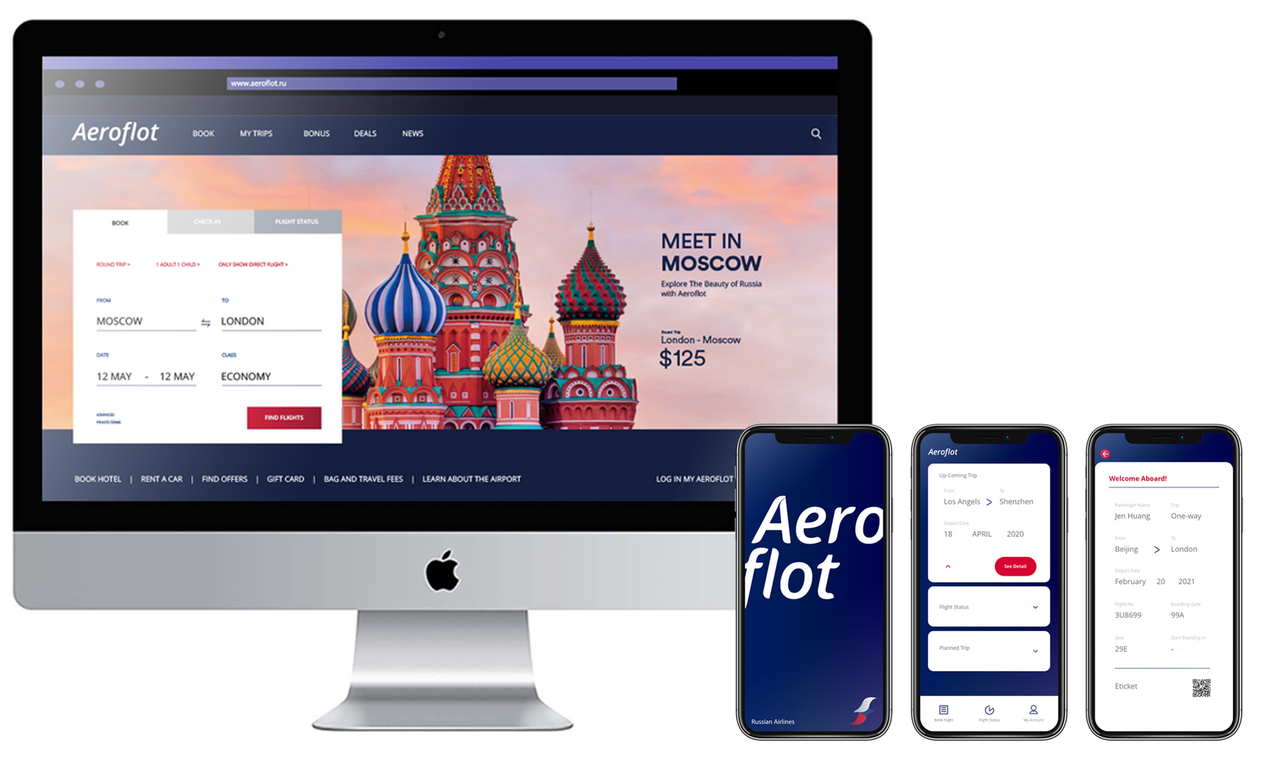
︎︎︎Digital
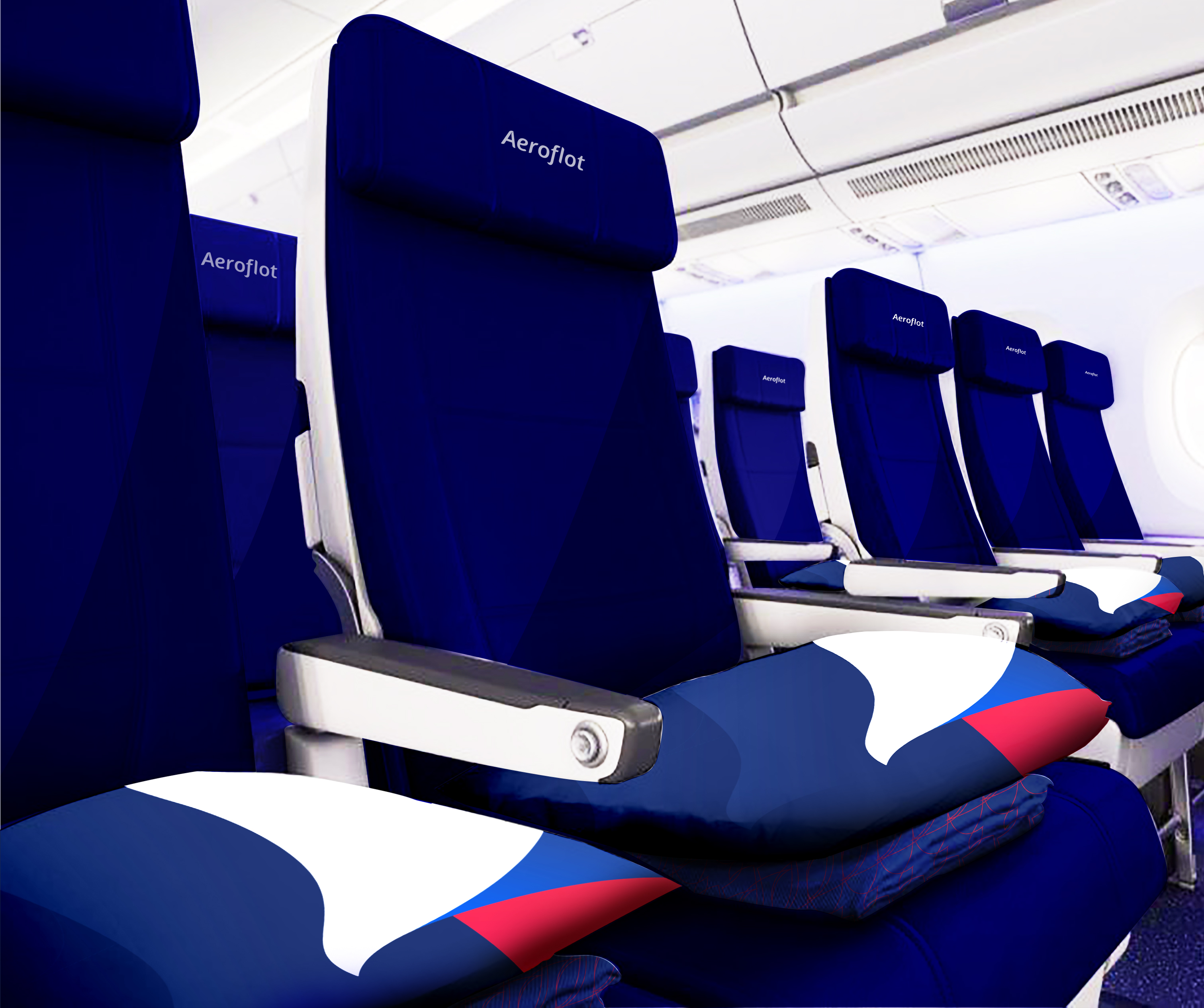
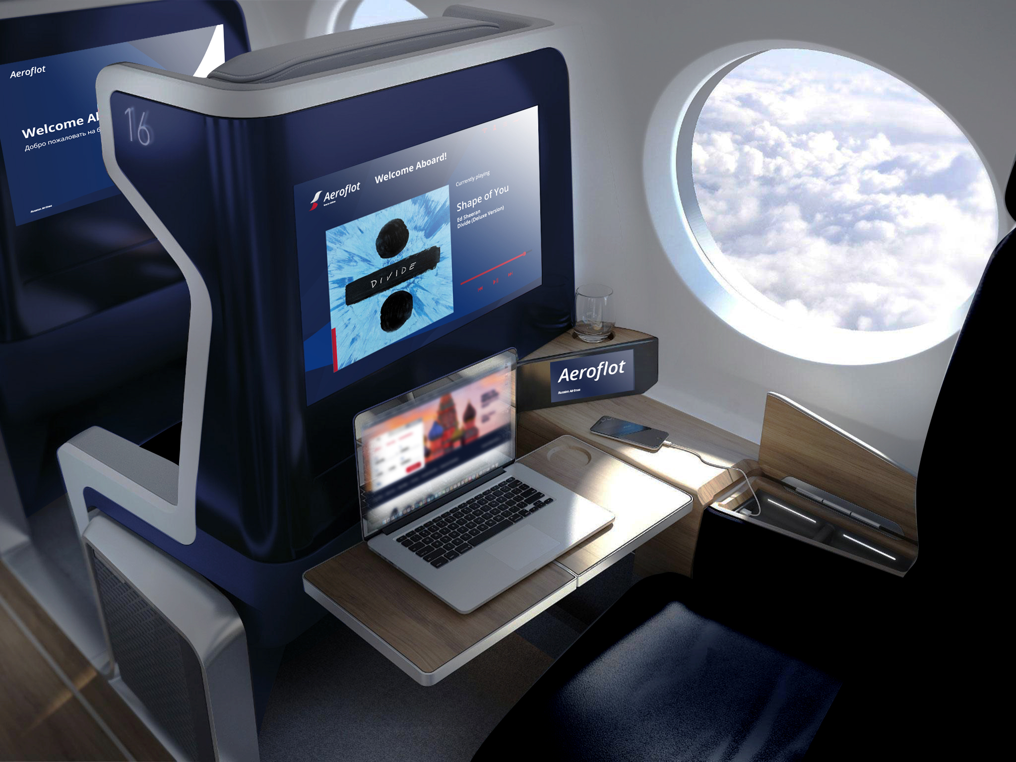
︎︎︎Interior

︎︎︎Uniform and Workspace


︎︎︎ NOOOISE Virtual Livehouse
︎︎︎ 21C Museum Hotel
︎︎︎ VICTORIA
︎︎︎ 19+1 Magazine
︎︎︎ Aeroflot Russian Airlines
︎︎︎ Human Abnormaliteis Clinic